Blue BikesRethinking the Bike-Share Experience
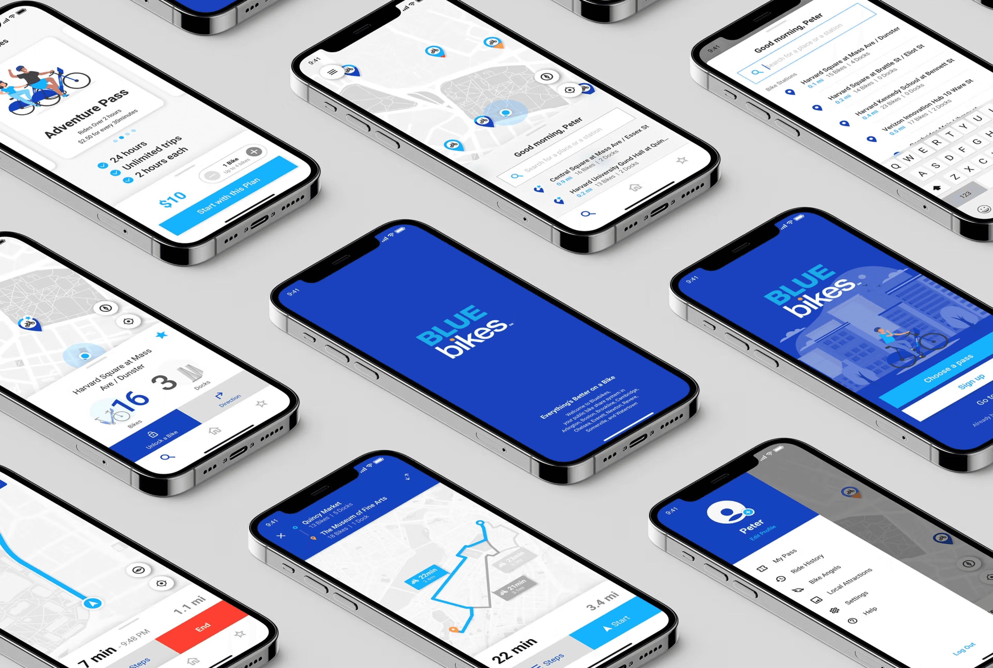
A UX/UI redesign for Boston's public bike-share experience, focused on first-time rider onboarding, clearer station information, trip history, navigation, local discovery, and safer reporting flows.

Introduction
Onboarding
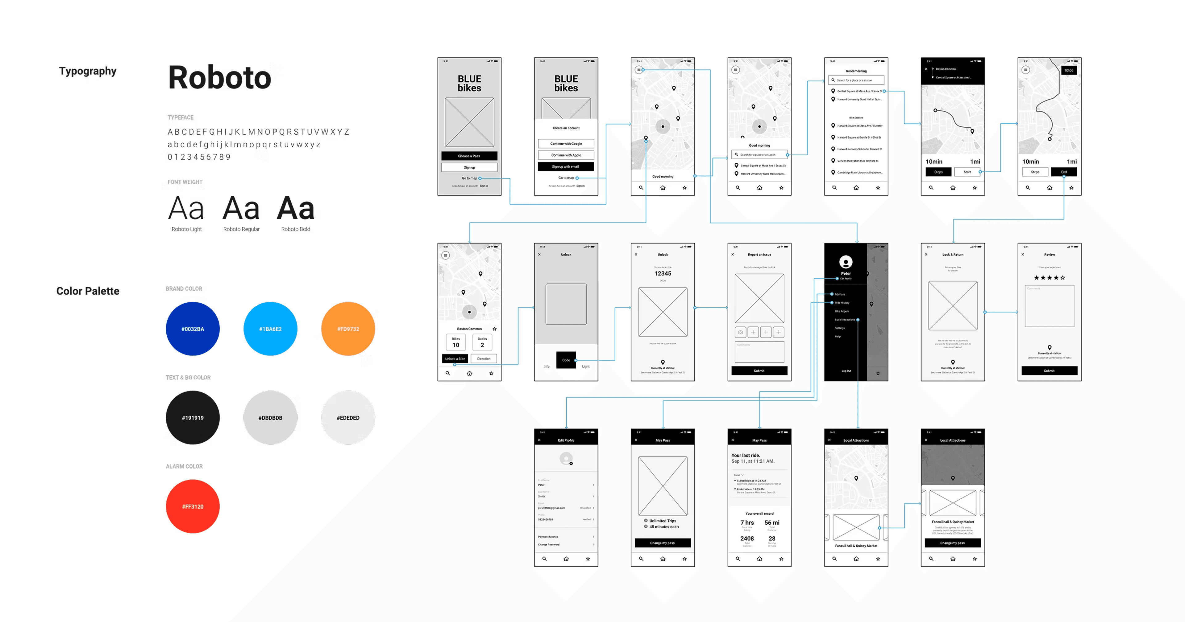
Added a simple tutorial so first-time riders can understand how the Bluebikes sharing program works before starting a trip. The flow uses a slider to preview each step, while the Skip action stays visible without interrupting the onboarding path.

Menu and State Bar
Search and Favorite List
Profile
Redesign
Brand New Interface
Check and Change My Pass
Access Ride History
Access History
Reviewing Personal Record
The subscription information page is added to the menu page so riders can access their pass record in only a few steps. They can also review overall records and riding courses on the map more intuitively.
Unlocking with QR Code
Unlocking with Number
Report Issues
Unlock
Unlock a Nearest Bike and Report an Issue
Navigating the route
End the trip & Post your experience
Navigation
Destination Guidance in Unknown Areas
Start and end controls are essential while riding. Enlarged buttons and visible colors help riders operate the navigation flow more easily, even when they are moving through unfamiliar areas.
Local Attraction
Favorite Ride Courses
New Features
Explore Boston with Bluebikes
Bluebikes is a helpful way to see Boston. Local attractions and favorite rides let visitors, guests, and everyday riders discover suggested courses around the city.
Addressing Safety Issues
Dark Mode
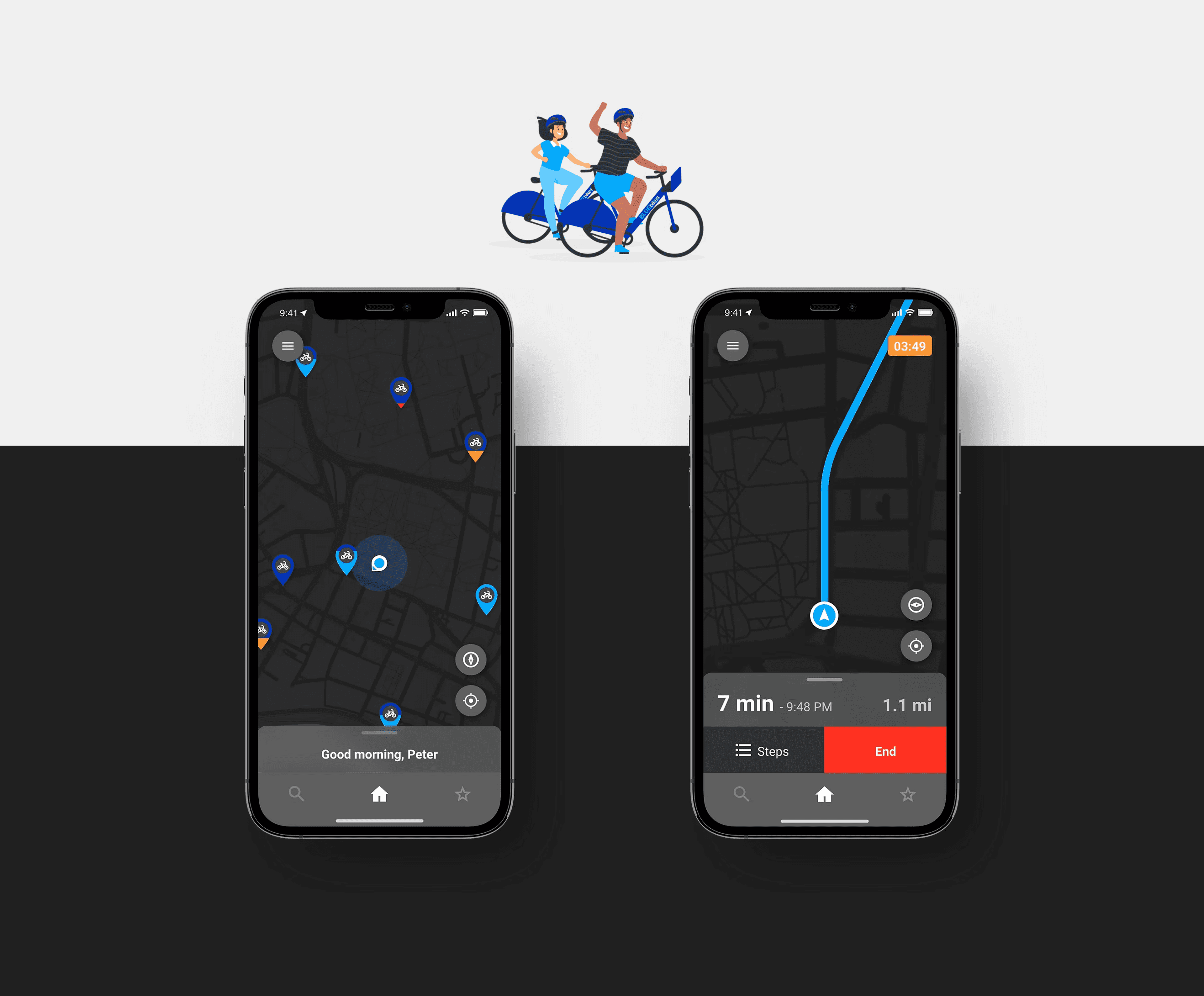
An Interface that adapts to the User
A dark version of the application improves readability in low-light conditions, supports battery efficiency, and reduces eye strain while keeping the riding interface clear.
Where I started
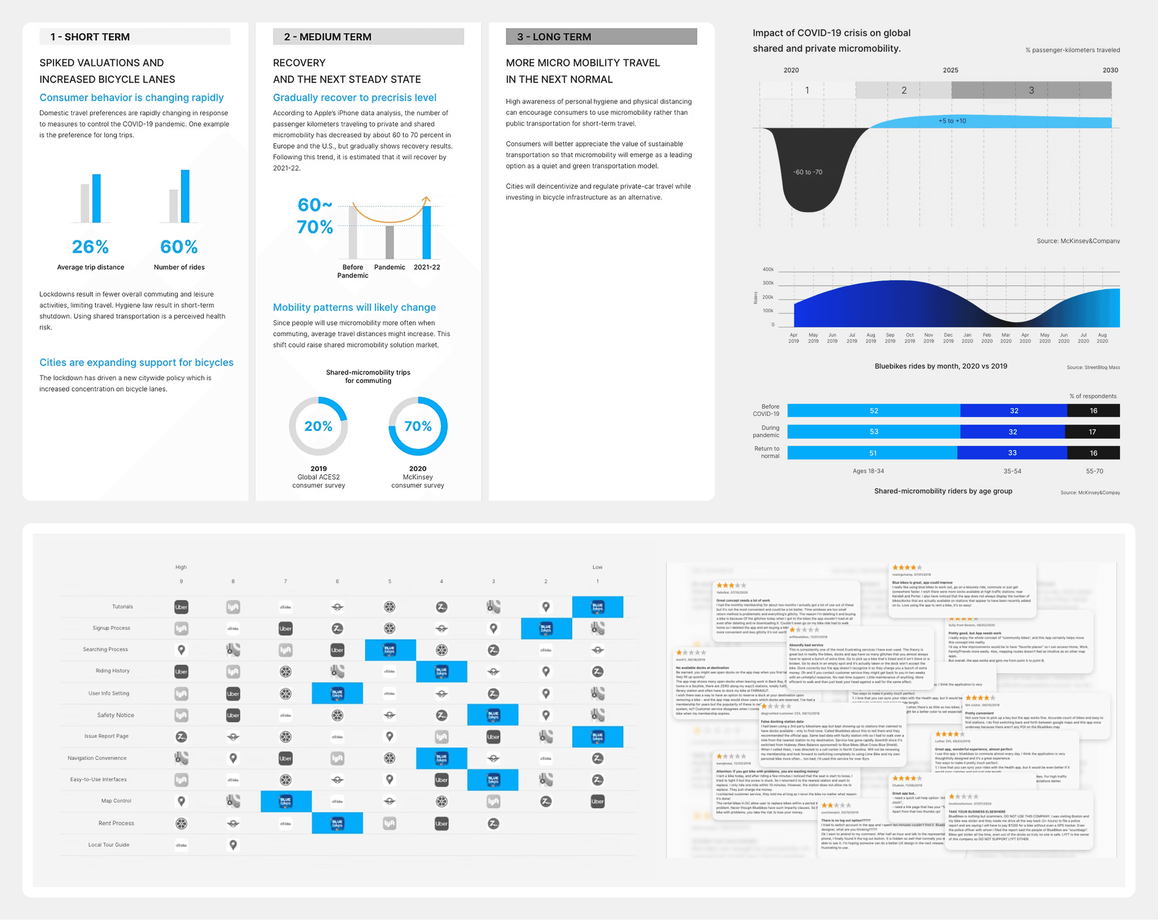
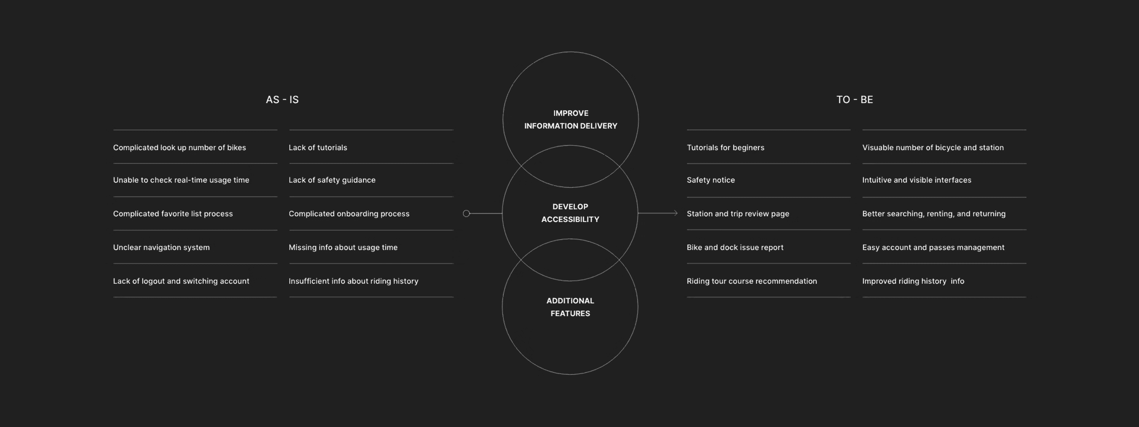
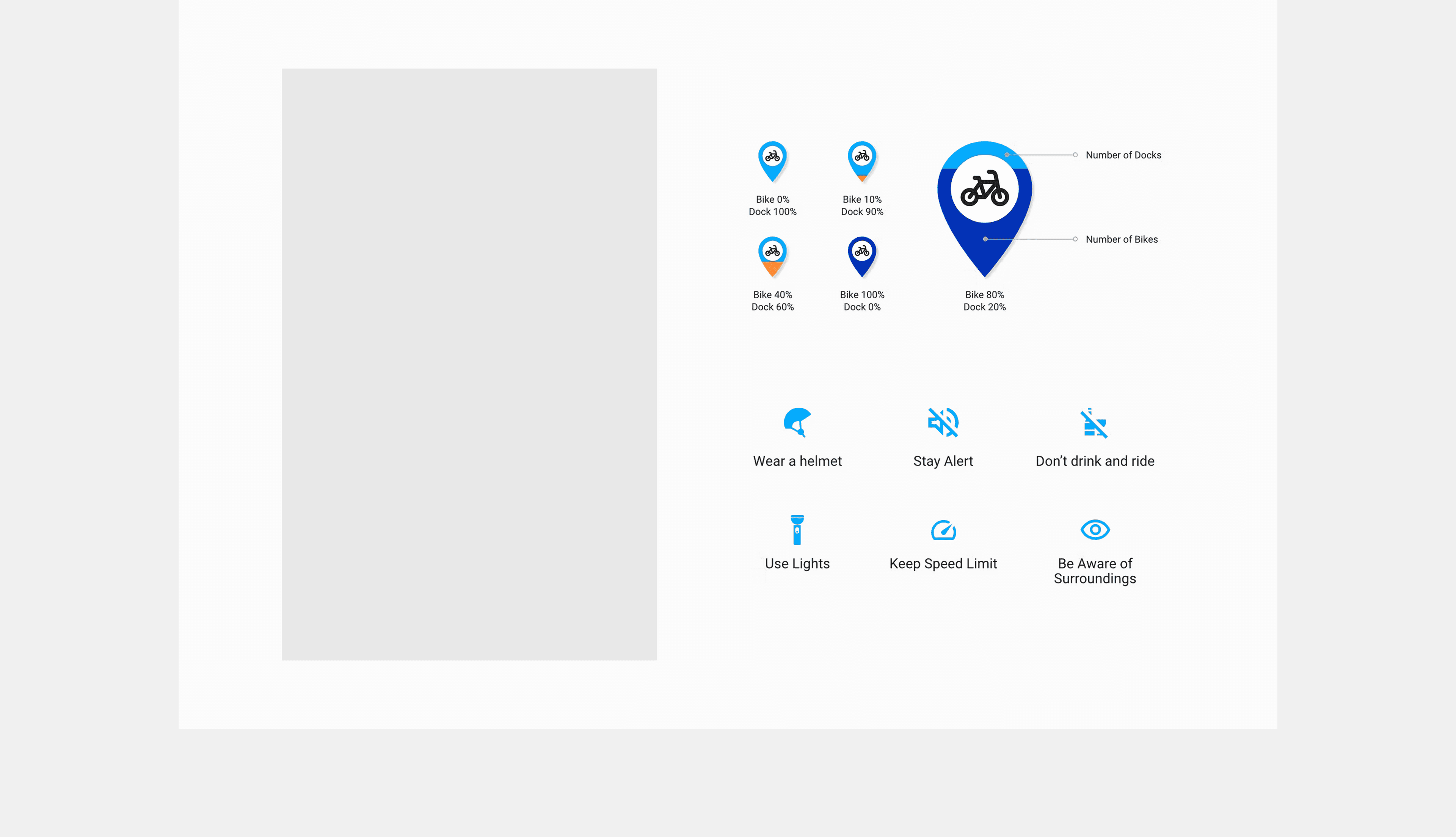
First-time riders, including visitors and tourists, need clearer tutorials, safety guidance, and easier rental flows.
As ridership recovered after the pandemic, the app needed to support more users with better access to station status, passes, navigation, and issue reporting.
Bluebikes had room to move beyond rent-and-return utility by supporting local exploration and recommended riding courses.
Designing the experience
Audited the existing Bluebikes app flow and benchmarked shared mobility and map-based products.
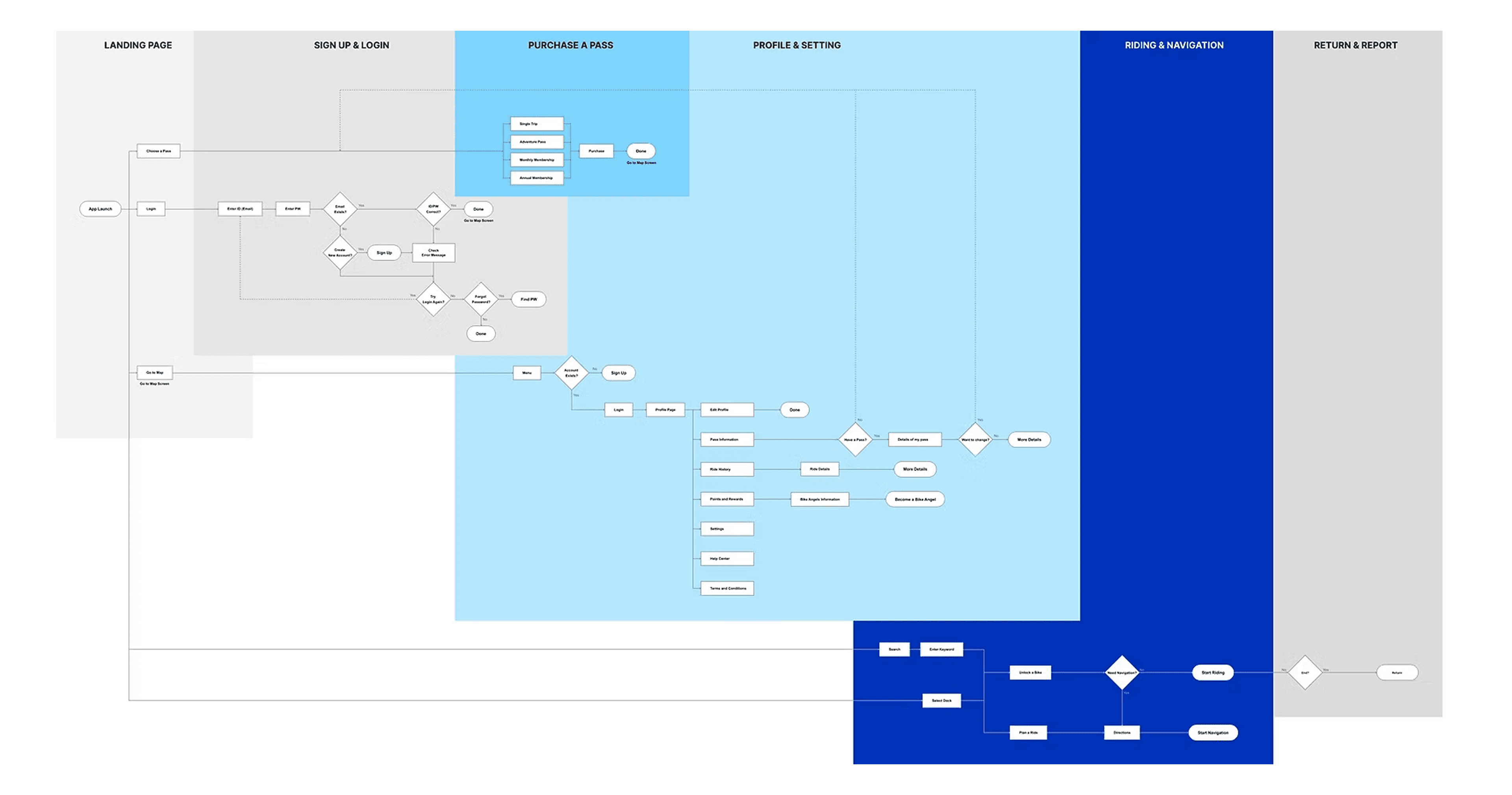
Redesigned information architecture, onboarding, station detail, unlock, pass history, navigation, safety report, local attraction, and dark mode flows.
Produced wireframes, high-fidelity UI, motion prototypes, and video mockups to communicate the renewed experience.
Learnings & reflection
Small interaction improvements can make a familiar public service feel more welcoming, especially for first-time riders.
Bike-share UX needs to work in motion, under time pressure, and in unfamiliar urban contexts, so visibility and direct actions matter.